Archive for September 2014

Principles Of Design - Week 9

No Comments »

30.9.14 (Week 9)

Jasmine Yeoh (0321190)
Principles of Design
Assignment 2A: Composition of Principles of Design 

Assignment:
Using the Principles of Design, we had to come up with our own design with our own idea and our own way of interpreting the principles such as Dominance, Unity, Contrast, Repetition, Proportion and Scale, and Balance/Symmetry.

I wanted to experiment with designing using photoshop because even though I have used photoshop before, I had never used it to create a design before so I used a collaboration of technology and doing by hand to produce the designs. Overall it was an interesting experience and I learned alot by using photoshop as I watched videos on how to use it.

Final Works:

Dominance is represented by the logo(which are my initials; JY) which is much larger than the other logos. Even though the logos in the background are of the same design, it draws less attention than the large logo in the corner.


 Balance/Symmetry
I created this design by first hand drawing 1/4 of the design I wanted then scanning it onto my computer. I used Photoshop to mirror the image to create a perfectly symmetrical image.


 Unity
This design is united by the colour as well as the triangular shapes even though they are different sizes, which all comes together to form an impression of a rose.


 Repetition
I first drew the design on the logo, scanned it, then repeated the logo many times. In result, it creates an interesting pattern.


 Contrast
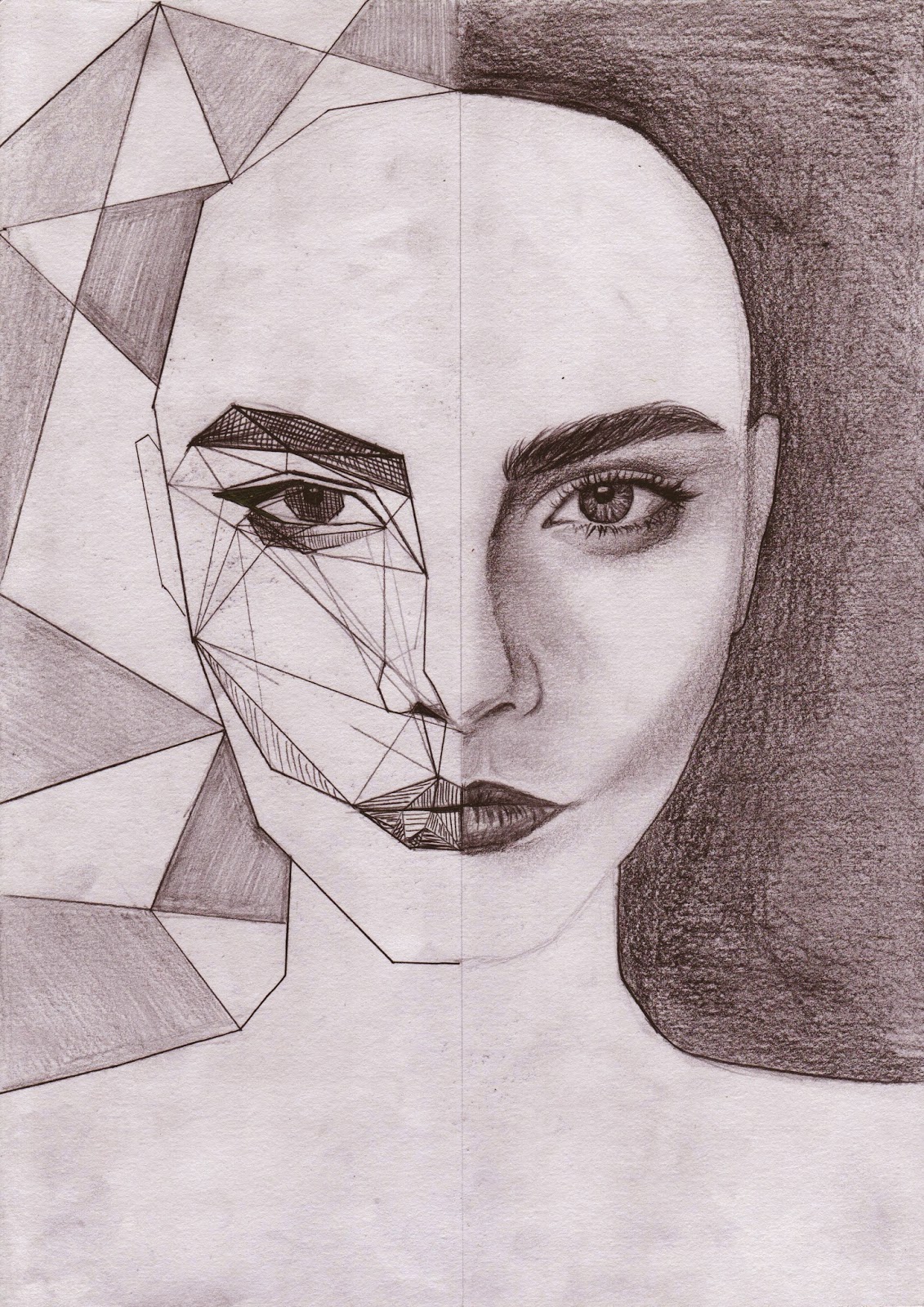
For this Principle, I wanted to think out of the box. This is the contrast between organic and inorganic (geometry).


Proportion and Scale
It was an obvious choice for me to do typography for Proportion and Scale because everything about typography involves proportion and scale and also, I really enjoy doing typography. 


Introduction to Photography - Week 8

No Comments »

29.9.14 (Week 8)
Jasmine Yeoh, (0321190)
Introduction to Photography
Exercise 4b: Principles Underpinning Composiiton

Lecture:
After the usual of Mr Vinod giving us all feedback on our ePortfolios, he gave us a lecture on the principles of composition while showing us examples. He asked us what principles we thought each  of the pictures are. He then gave us a tutorial on how to add the lines on the picture which show the Rule of Thirds. He then asked us to go around campus by ourselves and take candid pictures of groups of 3 people, applying the rule of thirds.

Class Exercise:
1)

2)

3)


Instructions:
Instruction for Exercise 4b
Exercise 4b: Principles underpinning composition
Capture 4 Images adhering to any of the mentioned principles below:
Domination/Emphasis • Isolation • Balance • Repetition • Alignment • Contrast • Rhythm • Symmetry/Asymmetry • Harmony
Print all 4 images on an A4 as instructed in class.
(Put to use what you have learnt in the Zone system exercises here)
4b) Principals underpinning composition (5%)
Marking Criteria: The image must show evidence of the dominant principle used and the supporting principles (if any) underpinning the composition. The principles underpinning the image must be named and should be visible within the image. Students must showcase their knowledge on exposure using the zone system.

1)Rhythm
ISO1600 / f4.5 / 1/50

2) Isolation
ISO100 / f8 / 1/160

3) Harmony
ISO100 / f5 / 1/400

4) Repetition
ISO100 / f8 / 1/20


5) Harmony (REDO)
ISO200 / f4 / 1/400

Screenshot:


Feedback
Jasmine, your pictures were good and seem to represent the principles mentioned, by and large. However, the picture representing harmony was perhaps in my view the weakest of the lot–I didn't see the characteristics that I would associate with such a principle. Having said the the pictures representing isolation and repetition were fantastic. The arrow was a nice touch and shows keen observation, while the composition of the tricky repetitive subject matter was well done, when utilising the rule of thirds.

Reflection:
Experience
In class, it was the usual morning routine of getting feedback from Mr Vinod and he told us that we just can't take pictures for the connivence and for the sake of the exercise. The tutorial on how to add the rule of third lines was also very useful. During his lecture on the principles, I enjoyed looking at the pictures and thinking what principles were present because one picture could represent so many principles.

When we had to go around taking pictures of random people, it was very awkward for me because I didn't know the people I was taking pictures of. This forced me to get out of my comfort zone and do something that I would usually feel shy and uncomfortable to do.

For the assignment, I went back to the art street in Shah Alam since I live close by. The pictures 2, 3 and 4 were taken there. Picture 1 was taken at a vintage pawn shop in Amcorp mall. 
"Rhythm" is represented in picture 1 because of the way the CDs were placed orderly on the wall.
 "Isolation" is a candid picture I took of my friend when he went off to look at the wall art by himself. I also like the arrow pointing directly at him, emphasising his "isolation"
Picture 3 represents "Harmony" because the hanging wood block displays a very sweet message to a loved one, wishing that he or she could grow old with them in harmony.
Picture 4 is "Repetition" because of them many identical fans on the building.
---
Picture 5 "Harmony" (REDO)
This picture represents harmony because nature the flower looks like its in it's rightful place, and not for example, plucked out and place in a vase. Nature is harmonious.

Observation
I realised while doing this assignment that, in order to get good shots, you would have to get out of your own way and sometimes do things which may make you look silly, such as taking pictures of random strangers, but that is the sacrifice you would have to take. I still have to work on being more confidant to do that though.

Findings
I found that if you really observe your surroundings and plan pictures in your head, you can find beauty all around you, you just have to apply good composition using the rule of thirds and good exposure.

Introduction to Photography - Week 7

No Comments »

22.9.14 (Week 7)
Jasmine Yeoh, (0321190)
Introduction to Photography
Exercise 4a: Composition – Rule of Thirds

Lecture:
At the beginning of class, Mr Vinod took a look at out hard copy portfolios and ePortfolios and gave us feedback. After that he talked about creativity then went on to talk about the topic which he told us to go through prior to the class, Rule of Thirds.

Instructions:
Exercise 4a: Composition – Rule of Thirds
Capture 3 Images adhering to the Rule of Thirds
• Using 1 person
• Using 3 persons
• Using a scenery
When placing the image on the document for printing; place one image with the Rule of Third lines visible and another without the lines side by side (as instructed in class)
(Put to use what you have learned in the Zone system exercises here)
4a) Rule of Thirds (5%)
Marking Criteria: The student must show evidence of knowledge and ability to use the Rule of Thirds under the prescribed circumstances. Evidence of composition enhanced by cropping is acceptable in order to heighten the dynamism or intensity of the picture. Students must showcase their knowledge on exposure using the zone system.


1) One Person - "Smoker"
ISO100  //  f5  //  1/125


2) Scenery - "Art Street"
ISO100  //  f8  //  1/400


3) Three People 
ISO100  //  f8  //  1/200

(REDO)

4) Three People
ISO400 / f5.6 / 1/640

Screenshot:


Feedback:
Your landscape and single person shot are excellent. Your three person shot was unimaginative and contrived, while technically inline with the rule of thirds. Composition is not about technicalities, it's about aesthetics, which you were able to capture in the single person and landscape shot. If all students were to use the three same people, where is the originality or creativity in that? You need to show more initiative, and I hope to see it in the next exercise. Redo, the three person shot again.


Reflection:
Experience
In class, Mr Vinod talked about the Rule of Thirds and I found the topic really interesting because prior to the lesson, I just took the picture however I thought looked good so seeing that there is a formula for a good picture makes it so much easier for me to get a great picture.

Me and my fellow classmates went to Laman Seni art street in Shah Alam to take the pictures for the assignment so it was really fun looking at all the street art and using the cool artworks as backgrounds to add a more interesting element to the picture. The colours of the artwork was also extremely vibrant and beautiful so it was a shame that I couldn't show that in my assignment so I look forward to going back in the future to take more pictures but in colour next time.

Observation
I am unable to catch moments because I take some time to adjust the settings of my camera and by the time I am done, the moment has passed so I need to be more efficient when doing so. 

Findings
I found that placing the point of focus at different points within the frame can make or break the picture. When placing the main subject in the middle, it makes the subject less interesting however, placing thing in the middle can be used effectively when emphasising symmetry. Placing the subject at the corner will give the picture an unsettling feeling and will move the viewer's eyes outward from the frame.


Introduction to Photography - Week 6

No Comments »


12.9.14 (Week 6)
Jasmine Yeoh, (0321190)
Introduction to Photography
Exercise 3b: Ansel Adam's Shot


Lecture:

In this lecture, Mr Vinod started by lecturing us on the zone system as well as showing us works by Ansel Adams. Then he gave us a demonstration on how to take a good portrait or any picture using the zone system. He sketched out the subject and labeled each tone referring to the zone system chart. He then gave us the assignment to take an "Ansel Adams Inspired" shot, where we have to take a picture of which all 9 zones are present. He told us the secret to a great picture; the choice of subject, good exposure and good composition.


Instructions:

Exercise 3(b):
The Ansel Adam's Shot
Choose an image worthy of being called an Ansel Adam's shot (Still Life, Landscape or Portrait). In using the Zone System sketch and write down the perceived zones in the desired image and indicate the ISO, Aperture and Shutter Speed used. Identify the point of interest and state the exposure settings recommended by the camera light meter and your improved settings upon using the zone system. The image captured must fulfill the following 
criteria:
3b) Ansel Adams Shot (5%)
Marking Criteria: Students must show evidence of using the Zone System. Student must produce 1 black & white image that captures depth and richness in tonal value by capturing light, middle and dark tones while maintaining details (texture and tone) in the dark and light areas of the image.

Sketch:

1) 1/30 // f4  // ISO 200

Final shot:
2) 1/60 //  f4 // ISO 200

Screenshot:

Feedback:
Jasmine, good choice of subject matter, it had texture and there was good lighting(as in daylight). The exposure was suitable and the depth in the picture was apparent with the rich tonality. Good.

Reflection:
Experience
Mr Vinod told us what we should improve in our ePortfolios and what we were doing wrong or leaving out. He advised us to do the exercises in class for a better result because the information and instructions are still fresh in our minds. When Mr Vinod was explaining about the zone system chart and how to label the different areas, at first I got a bit confused with the numbers, thinking that the higher number was the darker tones and the smaller number was the lighter tones when it was actually the opposite.

Doing the exercise, I tried to look for an area on campus where there were many tones and found that the trunks of the trees had many interesting growths on it that were different toned. I used the tree as my subject also because Ansel Adams took many pictures of trees and nature and I remembered the still life picture of the pine cone taken by him which was shown to us in class.

Observation

I don't have very steady hands and I tend to be very clumsy, so when taking the pictures of the subject using the meter and using my preference, I sometimes accidentally move the camera, causing the to pictures to be framed slightly differently. I either need to get a steadier tripod or be more careful when adjusting the setting on my camera when taking the next shot. I also found it difficult for my camera focus on objects which are to the side of the frame.

Findings

I need to pay attention to detail more when writing my ePortfolio, as I sometimes accidentally miss out some things when writing it.


Introduction to Photography - Week 5

No Comments »

2.9.14 (Week 5)
Jasmine Yeoh, (0321190)
Introduction to Photography
Exercise 3a: Zone System


Lecture:
This lesson, Mr Vinod expressed how disappointed he was in our ePortfolios so he gave general feedback to all of us. He then recapped the previous topics (Aperture, Shutter Speed, ISO) for those who might have had doubts. He then carried on into explaining the Zone System and talking about Ansel Adams to us and then at the end of the class, he gave us an exercise explaining Zone System.


Instructions:
Exercise 3a: Zone System
1. Capture three subjects: one light zones, middle zones and dark zones.
2. Take two images for each subject, one exposure according to the camera's light meter and the other according to the zone you believe the image falls under.
3. Ensure that the subjects you choose for each zone area (light, middle dark) have a good range of tones within the zone's area. As an example if you are capturing a subject that falls under the light zone and the subject is a white wall, it is only going to have 1 shade of the light zone, so avoid such subject matters, choose subjects that have a healthy tonal range within the white zone.


All pictures must be in black and white.


3a) Light, Middle & Dark Tones (5%)
Marking Criteria: The student must show evidence of using the Zone System technique to capture an ‘accurate exposure’ of a subject with light tones, a subject with middle tones and a subject with dark tones. An accurate exposure entails ‘visible tonal values and details’ in all three tonal areas.

1) White Zone
Zone 4
1/20  //  f3.5  //  ISO 200

Zone 7
1/10  //  f3.5  //  ISO 200

2) Grey Zone
Zone 4
1/60  //  f3.5  //  ISO 200

Zone 4
1/60  //  f3.5  //  ISO 200


3) Black Zone
 Zone 3
1/4  //  f3.5  //  ISO 800

Zone 2
1/10  //  f3.5  //  ISO 800

Screenshot:

Feeback:
Jasmine, the exercise is accurate in that it fulfills the requirements of the criteria, but, the lighting for the light zone did not seem natural. The exercise is to be conducted in natural light settings (or a mix of both but primarily natural light - windows) -- In your reflections you mentioned taking pictures in many stops (shutter speed) because you could not decide. As I explained in the previous class, determine your ISO first, then your aperture (if not shooting a fast moving object) then your shutter. Once you determine the first two you camera would pretty much indicate the "right" exposure accordingly, and you then match it to the zone chart. Then determine where you think it should be in the zone chart and expose accordingly. Overall I think you fared well, although I can't help feel, that you have not grasped the "implementation part" fully.

Reflections:
Experience
During class, if was really interesting seeing the pictures taken by Ansel Adams and how he took those pictures. It made me appreciate the cameras we are using now because during Ansel Adams' time, the cameras, tripod and other camera equipment was very big, bulky and heavy. It made me appreciate the pictures more as I looked at them after I knew that he had to carry all that equipment up mountains and not to mention, the use of film so you cant simply take and delete photos, as well as the absence of Photoshop so they had to burn the picture to make certain areas darker. 

I liked doing the exercise and finding the subjects which had white, grey and black tones to take a picture of. However, while taking the actual pictures I found it difficult deciding which shutter speed to use which will affect how over exposed or under exposed the subject will be, so what I did was that I took many pictures at each stop and decided later when review my pictures.

Observation
By doing the exercise, it has shown me that even though there is a zone system chart, not everything can be put into a zone. I've also realised while taking the pictures for the "white zone" that once you over expose something, it is almost impossible for you to undo it, even through editing so it is crucial that you choose the right stop on your light meter.

Findings
I found out that you shouldn't always trust technology because typically, they've been programmed a certain way to do things by formula, so with that being said, camera light meters are dumb in a sense that they don't know what is being taken a picture of so they are assuming everything is middle grey when actually the world is full of tones. I've also discovered that by understanding the Zone System, the lighting in my pictures are much better compared to the pictures I've taken prior to the class.