Archive for 2014

Principles Of Design - Week 18

No Comments »

13.12.14 (Week 18)
Jasmine Yeoh (0321190)
Principles of Design
Final Assignment: Card Making

Assignment:
We had to create 2 greeting cards using themes chosen by ourselves. The themes included pop-up, typography, doodling, cut-out, etc. We were to present our strengths and show what we were good at.

I presented two themes to Ms Lisa, doodle/characterture and typography. Ms Lisa instructed me to do typography as i was much better at it than the other theme i did. She suggested I do a watercolour background after seeing the work i did for another class. She also suggested i use glitter and cut outs to make the card less flat, which typography typically is.

Following Ms Lisa's suggestions, i did a watercolour background for both my cards, using appropriate colours according to the occasion; Pinks and reds for Valentines day and bright/happy colours for birthday. I tried to incorporate interactive features such a pop-ups and dangling hearts to add a more interesting factor to my cards. I kept the cover of the cards very minimal because i wanted to focus to be on the inside of the card.

Overall, I really enjoyed doing this assignment because i love typography and i usually create cards for my friends so it wasn't anything new for me.


Pictures of the process:


Principles of Design - Week 17

No Comments »

4.12.14 (Week 17)
Jasmine Yeoh (0321190)
Principles of Design
Colour Wheel Assignment

Assignment:
We had to produce an unconventional colour wheel by creating a 3D model which displays the 12 colours in the colour wheel.

I was pretty excited about the assignment when we first got it because I had a lot of ideas to suggest to my team mates, such as a hot air balloon, baking cupcakes and baking a rainbow cake. In the end, the Ms Lisa and the team decided to do a hot air balloon and we were all excited about it. 

We researched extensively and thought that it was quite do-able. We used lightweight raincoats as the panels for the hot air balloon and wire for the structure. We began by making a small scale prototype and we were overjoyed when it actually worked and floated up. However, when making the actual thing, our project got damaged and stolen so we had to redo everything. 

We purchased multiple colours of craft tissue paper because we researched and people had made successful DIY hot air balloons using it. We created a small lantern out of the tissue paper and it worked! Unfortunately, the tissue paper accidentally caught fire and burnt much of the lantern. Once again, we had to redo it. 

Sadly, we had to come up with something extremely last minute and made a stagnant hot air balloon model. I was very disappointed in the outcome and i wish i could have done a better job but i did my best with the circumstances.

Final Outcome:


Introduciton to Photography - Week 15

No Comments »

22.11.14 (Week 15)

Jasmine Yeoh, (0321190)
Introduction to Photography
Studio Lighting

Lecture:
There was no lecture this week but we laid out all the printed out studio portrait pictures and examined them. We then went on to learn about lighting with softboxes beauty lights.

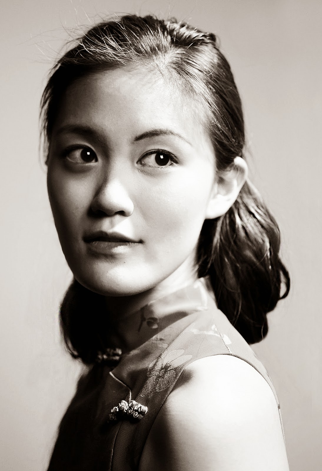
 Pictures from the session:


Reflection:
While we were looking at the developed and printed pictures, I learned quite a few things on what to do and what not to do that might help me for when I go to print my final theme based pictures. Don't over edit your pictures because it will be very obvious and unnatural. Being asian, and if the subject's eyes are completely dark, they might look lifeless. To avoid this "catchlight" may be used. It is when the the the reflection of the lighting can be seen in their pupil.

As for the lighting exercise, the class tried using the softbox lights to create a rim lighting effect. It was extremely difficult to get the lighting on each side of the face to be equal because the position of the lights have to be equal so we had to keep adjusting them and  then taking a picture to check how it looks like as well as take the reading from light meter. I had to hold the light meter at the exact spot every time because if it I moved even just a bit the reading would be different, therefore making it an inaccurate reading. 

I observed that a softbox lighting gives a more even and soft lighting effect compared to the main light that we used during the previous classes. I noticed that the main light is used to create more shadows. i also learnt that flash lights emit can emit more light compare to main lights because it is using power for only a flash, therefore more power can be used to make the light source brighter.

Theme Based Project
Theme: Lines 
"The Parallel Universe"

1)

2)

3)

4)

5)

6)


Rationale
“The Parallel Universe”

About the Photographer
Jasmine Yeoh (born 2nd April 1998) is a student at Taylor’s University Lakeside Campus who is currently studying Foundation in Design. When I was put in the position of picking an elective for this course, between the two options, “Photography” was the obvious choice for me. I was automatically drawn towards this subject. To me, it was like painting a picture and creating a piece of art but instead of using paints and pencils, you have a camera and your surroundings. I was eager to learn how to use a DSLR camera because for years I’d always watched my sister use her camera to produce beautiful pictures. She would let me have a go every once in a while but I’d always use the auto settings so it was interesting to learn how to adjust the settings manually.

About the Photographs
My series of pictures have the theme of “lines”. I titled it “The Parallel Universe” as a play of words since all of my pictures have an emphasis on parallel lines.  All of the pictures were actually taken on the Taylor’s University Campus but it is almost unrecognisable. I went around the campus to try to look for the hidden pieces of art that I usually walk past everyday and this project allowed me to look at the campus in a completely different way. I saw everything as an art piece. I framed the picture at specific angles to convert the ordinary into repetitive patterns, and geometric shapes.

When taking the photos, the settings for my camera varied for each picture because they were in different lighting scenarios. The first picture was taken in the basement car park, where the lighting was rather dim so I set the ISO at ISO1600 which unfortunately pixelates the picture slightly. The second picture was taken as the sun was setting and the natural light was fading but the artificial light gleaming at the top corner of the picture adds more tonal value. The third and forth picture were taken with significantly more natural light available than the other pictures in the series which gives a totally different vibe in comparison with them. The rest of the pictures also have a deeper depth of field while picture 3 and 4 have a shallower depth or field. For these pictures, I wanted to create three dimensions instead of it just being flat and two-dimensional. Therefore, the geometric structure of picture 3 almost looks as if it is an optical illusion and the stripes of picture 4 look as if they are going further away from you. The fifth picture is contrasting in two senses of the word. There is high contrast between the line and the dark floor, and it is the most simplistic of the series with the single line and dot, which creates variety in the series. The last picture features elements from the other pictures in the series, with the repetitive lines like picture 4, the single line from picture 5 and the corner of the picture that is similar to picture 2. Therefore, I think that it is an appropriate picture to wrap up and tie together the entire series. While editing the photos, the cropping and straightening tool played a prominent role in helping me achieve the look I envisioned. That, and I tried to follow the Rule of Thirds very closely to give a very clean-cut finish to the pictures.

In summation, I definitely do not regret taking this subject as an elective as it has taught me so much and has turned love for photography from a small spark to a burning fire.


Introduction to Photography - Week 14

No Comments »

15.11.14 (Week 14)

Jasmine Yeoh, (0321190)
Introduction to Photography
Studio Lighting Exercise: Part 2

Lecture:

Studio Lighting Exercise:
Instructions:
We had to chose a photograph of a portrait from the 1920s-1960s and try to mimic photo's lighting, make-up, clothing and hair.

Velisa's 1960's Period Picture:

Theme Based Project: Lines

1)

2)

3)

4)

5)

6)

7)

8)

9)

10)

11)

12)

13)

14)

15)

16)

17)

18)

19)

20)


Reflection:
This class, I got to take Velisa's picture and direct where the lighting should go and how she should pose. I enjoy working as a group to try to help each other out by giving feedback, doing each other's hair and make-up and helping by moving the lights around. 

For my theme, Mr Vinod told me that I should look into doing a theme based on a previous week's "wow factor" pictures. So based off those pictures I decided on the theme "Lines". I played mostly with symmetry and following the rule of thirds closely. I have 20 pictures this week since I have missed previous week's 5 theme based photos.

I found it difficult to place the lighting correctly at first but then I got the hang of it as I tried it hands on while taking Velisa's picture, instead of watching other people do it and following instructions like I did last week.

Introduction to Photography - Week 13

No Comments »

 9.11.14 (Week 13)
Jasmine Yeoh, (0321190)
Introduction to Photography
Studio Lighting Exercise

Lecture:
At the beginning of class, Mr Vinod went through the study material on studio lighting he posted on facebook and clarified our doubts. Later we went to the photo studio to do our studio lighting exercise.

Studio Lighting Exercise:
Instructions:
We had to chose a photograph of a portrait from the 1920s-1960s and try to mimic photo's lighting, make-up, clothing and hair.


Reflections
Experience
I learnt the different types of lighting and how each one is important and has a special task. I also learnt about the different portrait lighting patterns. I learnt that they can be quite similar and the same lighting pattern may that different names.
It was fun trying to imitate the photograph I chose and helping other people with their hair and make-up because I enjoy dressing up and doing make-up and hair. I also had to help hold a reflector which essentially reflects a small amount of light to an area but I found that it really does make a difference. While I was posing for the picture, the lights were really hot and glaring but it was overall, enjoyable following direction. The pose of the photograph was very unnatural so it was difficult to mimic it. I also enjoyed editing the picture of photoshop and playing with curves to achieve the high contrast effect of the original photograph.

Observation
It is quite difficult for me to differentiate the different lighting patterns while watching the others take their pictures but I am excited to try it out myself next week when I get behind the camera.

Findings
I found that when people take studio shots, their make-up is usually exaggerated more due to the harsher lighting therefore, I found it interesting when I did my make-up because in real life, it looked very over done but it looks good in the picture. 

Introduction to Photography - Week 12

No Comments »

5.11.14 (Week 12)
Jasmine Yeoh, (0321190)
Introduction to Photography
CTS Class Trip Exercise: Refreshing Spring Resort

Exercise:
Mr Vinod instructed us to take pictures while we were away on our class trip to Refreshing Springs resort.

Instructions:
"Since you are going on a trip this Friday, I would like you all to take another five pictures just as practise and attach your reflections with it for the following week as well."


1.

2.

3,

4.

5.


Reflections:
Experience
It was nice change of scenery and to get away from the busy city life. Everything was new and exciting to me because you really can get anything like the environment there, elsewhere. 

While I took picture 5, I got the idea to do the theme "magnified" and take pictures of small objects using magnify glasses or shooting things extremely close. I think this could be a much better theme as the topic allows a much broader option for pictures.

Observation
I realised that when I go around looking for subjects to take a picture of, I notice the beauty in the most ordinary things that I would usually just pass by without giving it a second glance if I weren't intentionally looking for a good shot.

Findings
I found that taking pictures of objects up close makes the picture much more interesting than if you take it from far away, as you can see the intricate details and texture in everything better. Also, I found that cropping can really help your picture become better and more pleasing to the eye.

Principles of Design - Week 13

No Comments »

27. 10. 14 (Week 13)
Jasmine Yeoh (0321190)
Principles of Design
Composition

Assignment:
We had to use the rule of thirds as well as a frame which we cut out to produce well composed pictures within the frame. We had to propose a number of themes to Ms Lisa and eventually, she guided me to choose the theme of "Shoes".

It was a fun assignment as I already knew about the rule of thirds from my chosen elective; Photography so it was pretty easy for me. I enjoy talking pictures but to properly frame the picture with the cut-out frame was a challenge for me. It was also fun because I had to match the colour of the shoe with the colour of the background and direct how the model should pose.


Introduction to Photography - Week11

No Comments »

17.10.2014 (Week 11)
Jasmine Yeoh (0321190)
Introduction to Photography

Lecture:

Mr Vinod talked about our topics we asked questions on the brief feedback he gave regarding the topics. We then went to the photo studio and cleaned the mess the graduating class made and Mr Vinod showed us the equipment and where is should go. We then went to take our "Wow Factor" shot.

Instructions:

Go around campus to take a "wow factor" picture and later resize the image and canvas size and edit accordingly using photoshop. 

Class Exercise

1) ISO200 / f3.5 / 1/250


2) ISO200 / f4 / 1/160

3) ISO200 / f4 / 1/30


4) ISO200 / f4 / 1/30


5) ISO200 / f4 / 1/30


Reflection:
I was quite happy with the "wow" factor pictures I had taken this time around. I had gotten more pictures because I became more comfortable with going around and taking pictures in public without caring if I were in an awkward position while taking the picture or taking a picture of something that might seem silly.

While we cleaned the photo studio and learnt where everything went, I learnt that we should be very careful with all the equipment if we were to use them or move them around because they are very expensive and difficult to replace.


In class, I expressed that I was STILL unsure about my theme and Mr Vinod mentions that we can get inspiration from everything and anything we do. He told us about how he got the idea for a theme to shoot sweaty bodies from a business magazine. So I think i am going to rethink my theme once again and look through some magazines for inspiration.

---
I had not realised I didn't publish this post and it was still a draft. I apologise, Mr Vinod!